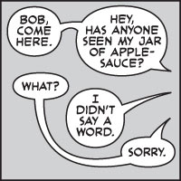
If you thought comic-book lettering was simply a case of putting words in a balloon, and maybe adding a BIFF! here and a POW! there, then think again. An article by Nate Piekos, entitled Comics grammar and tradition explains all.

If you thought comic-book lettering was simply a case of putting words in a balloon, and maybe adding a BIFF! here and a POW! there, then think again. An article by Nate Piekos, entitled Comics grammar and tradition explains all.
Privacy Policy
Web design by Neptune Media